PopupEase —
Mobile UX/UI Case Study
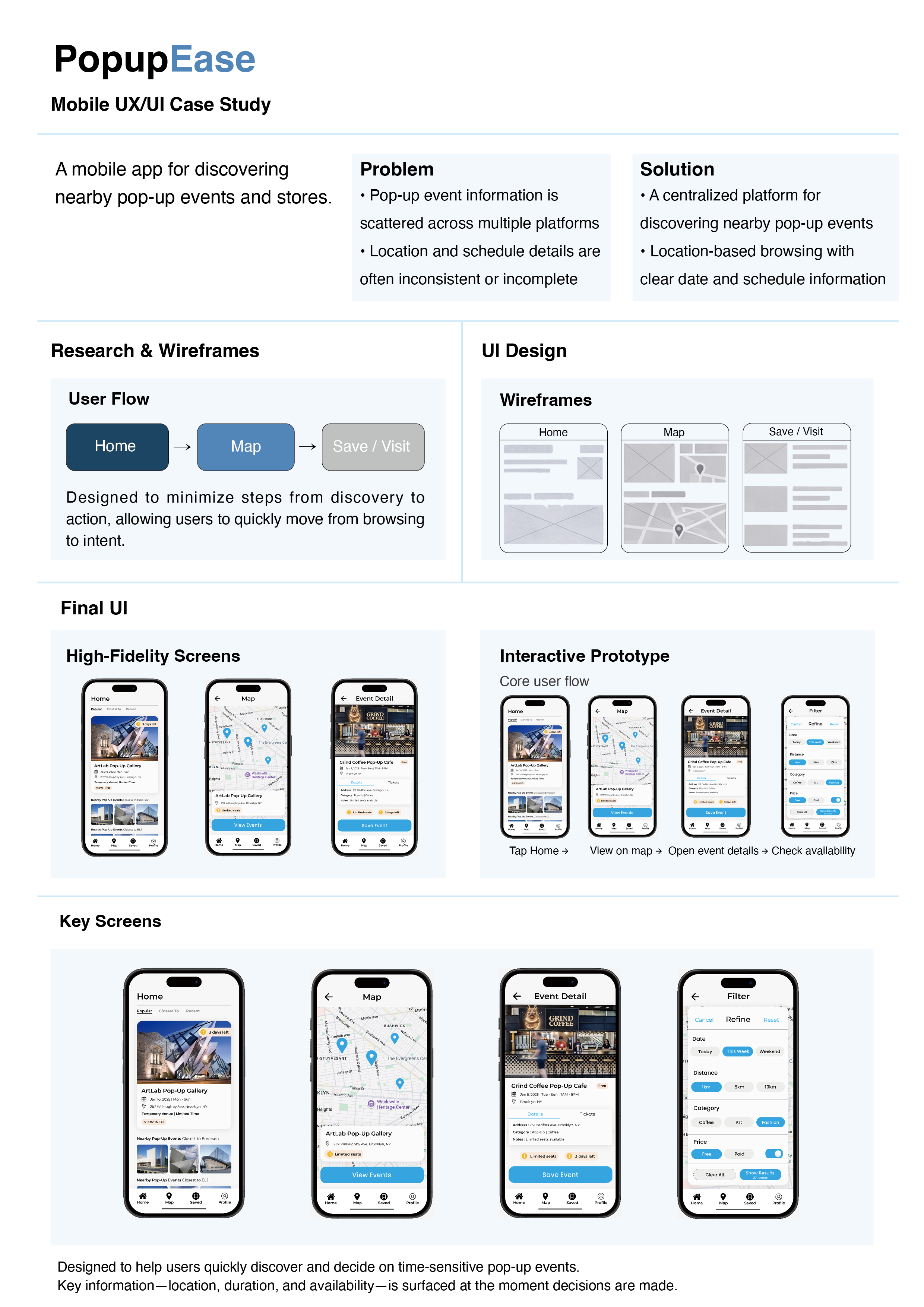
PopupEase is a mobile UX/UI case study focused on helping users quickly discover and decide on time-sensitive pop-up events.
The project addresses challenges around fragmented information, unclear locations, and limited availability by organizing essential details at the moment decisions are made.
The design prioritizes clarity, speed, and confident decision-making through structured navigation, map-based browsing, and streamlined event details.
Summary
PopupEase is a mobile UX/UI project designed to support the discovery of time-sensitive pop-up events.
The project explores how interface design and information hierarchy can help users move quickly from browsing to decision-making when events have limited duration, shifting locations, and constrained availability.
Rather than focusing on event promotion, PopupEase prioritizes clarity, speed, and confidence—surfacing essential information at the exact moment users need to decide.
Project Focus
PopupEase is designed for users who want to explore pop-up events without the friction of searching across multiple platforms.
Because pop-ups are temporary by nature, the app emphasizes where events are happening, how long they last, and whether they are still accessible.
The core focus of the project is not visual novelty, but supporting fast, informed decisions in a time-sensitive context.
UX Challenge
Pop-up event information is often fragmented across social media, maps, and ticketing platforms.
As a result, users frequently encounter incomplete details, outdated locations, or unclear availability.
The challenge was to design an interface that:
Reduces cognitive load during browsing
Communicates urgency without visual clutter
Helps users decide quickly before opportunities disappear
Design Approach
To address these challenges, the design focused on the following strategies:
Location-driven exploration
A map-based interface allows users to immediately understand where events are happening in real time.Time and availability cues
Clear indicators such as remaining days, limited seating, and free entry are surfaced early in the flow.Minimal, decision-oriented structure
Screens are simplified to highlight only what matters at each step—browsing, exploring, and saving.Reduced steps from discovery to action
The user flow was intentionally designed to move efficiently from Home → Map → Event Detail → Availability.
Core User Flow
The interactive prototype demonstrates a focused core flow:
Tap Home → View on map → Open event details → Check availability
Each screen is designed to present the most relevant information at the moment a decision is made, minimizing unnecessary navigation or secondary actions.
The Result
The final prototype presents a streamlined experience for discovering and evaluating pop-up events.
By prioritizing location, duration, and availability, PopupEase enables users to make faster, more confident decisions in a context where timing matters most.
The project demonstrates how thoughtful UX structure and clear information hierarchy can meaningfully improve usability in temporary, fast-changing environments.