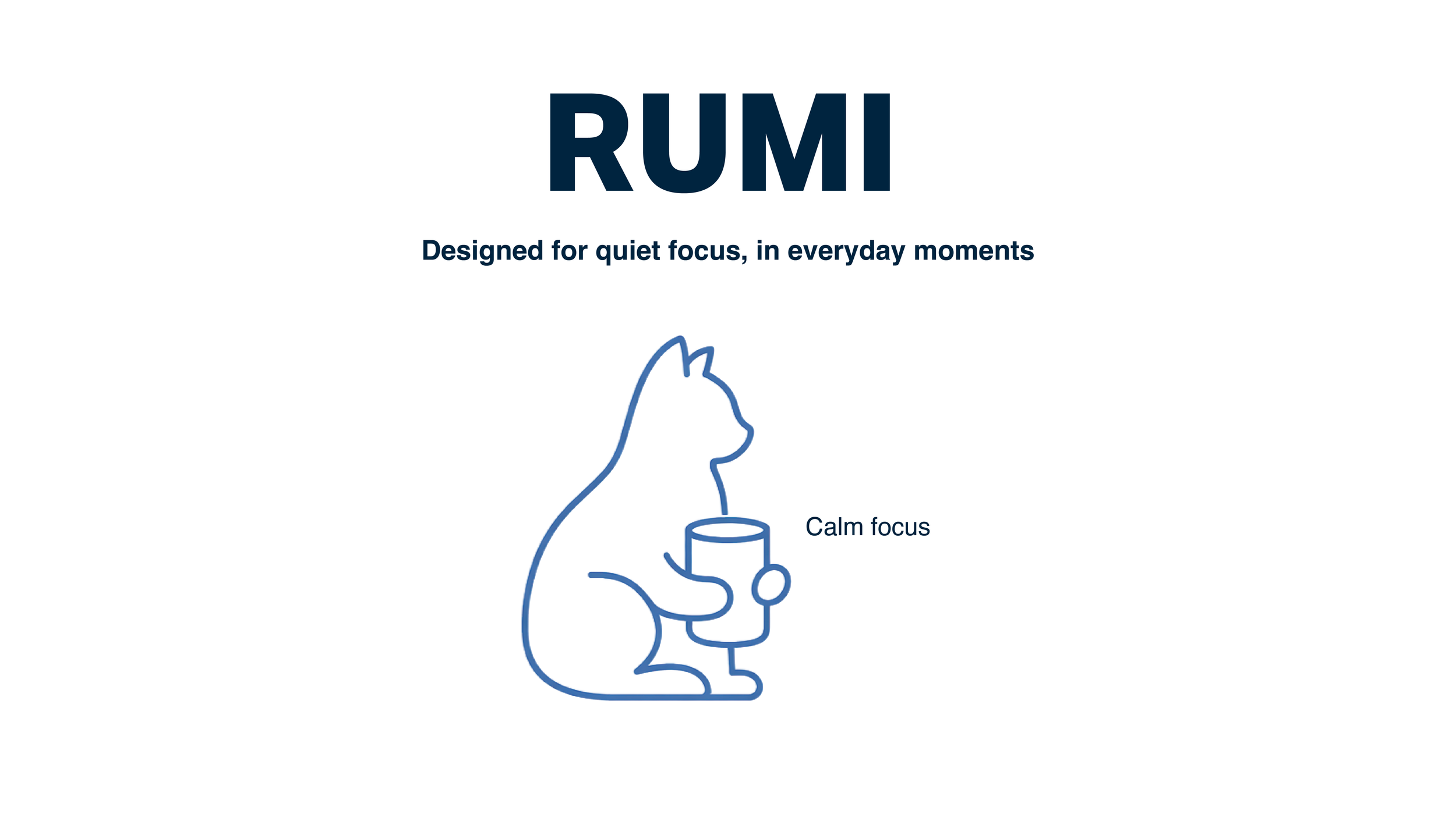
RUMI
Brand Identity · UX/UI Extension
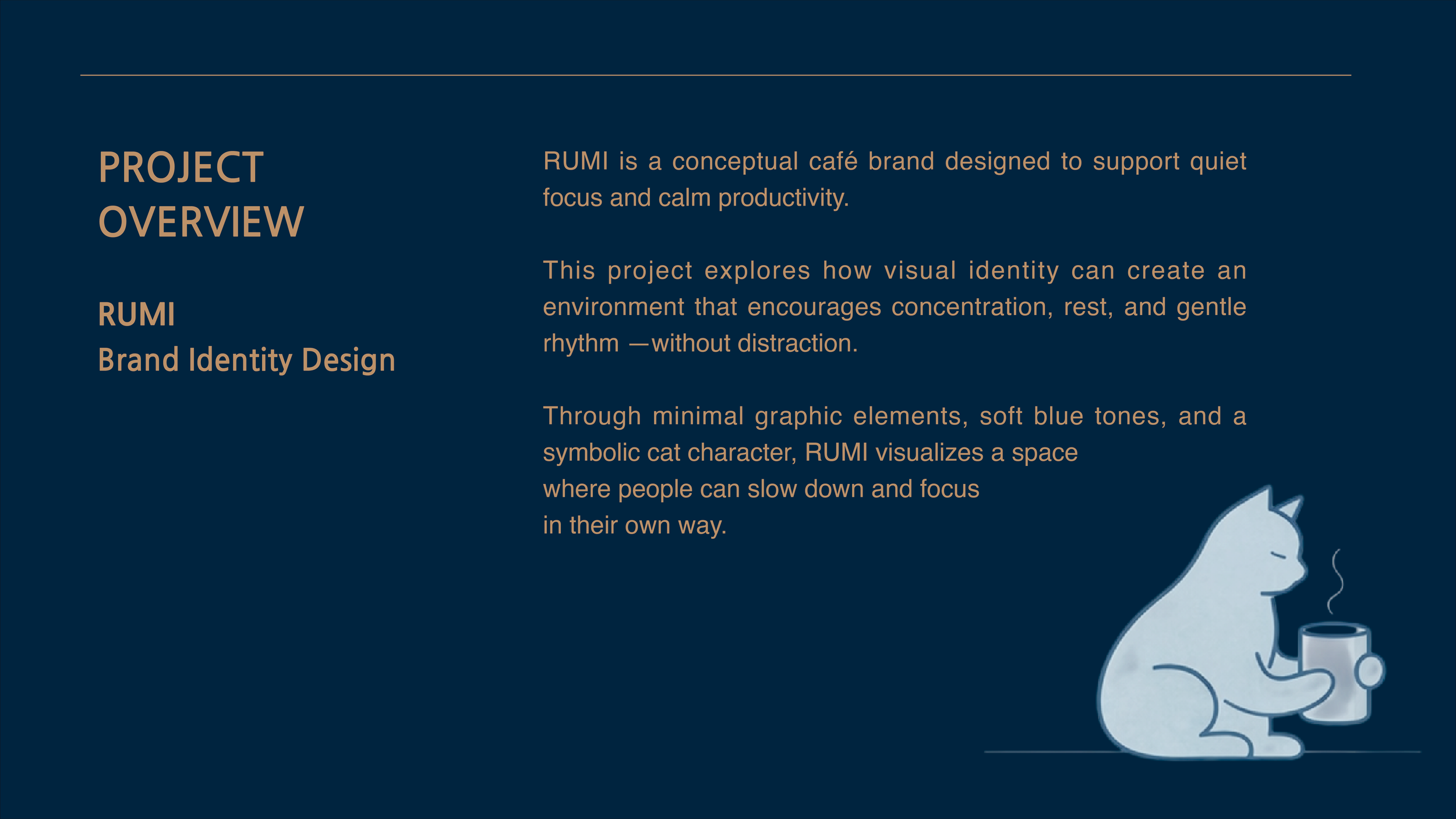
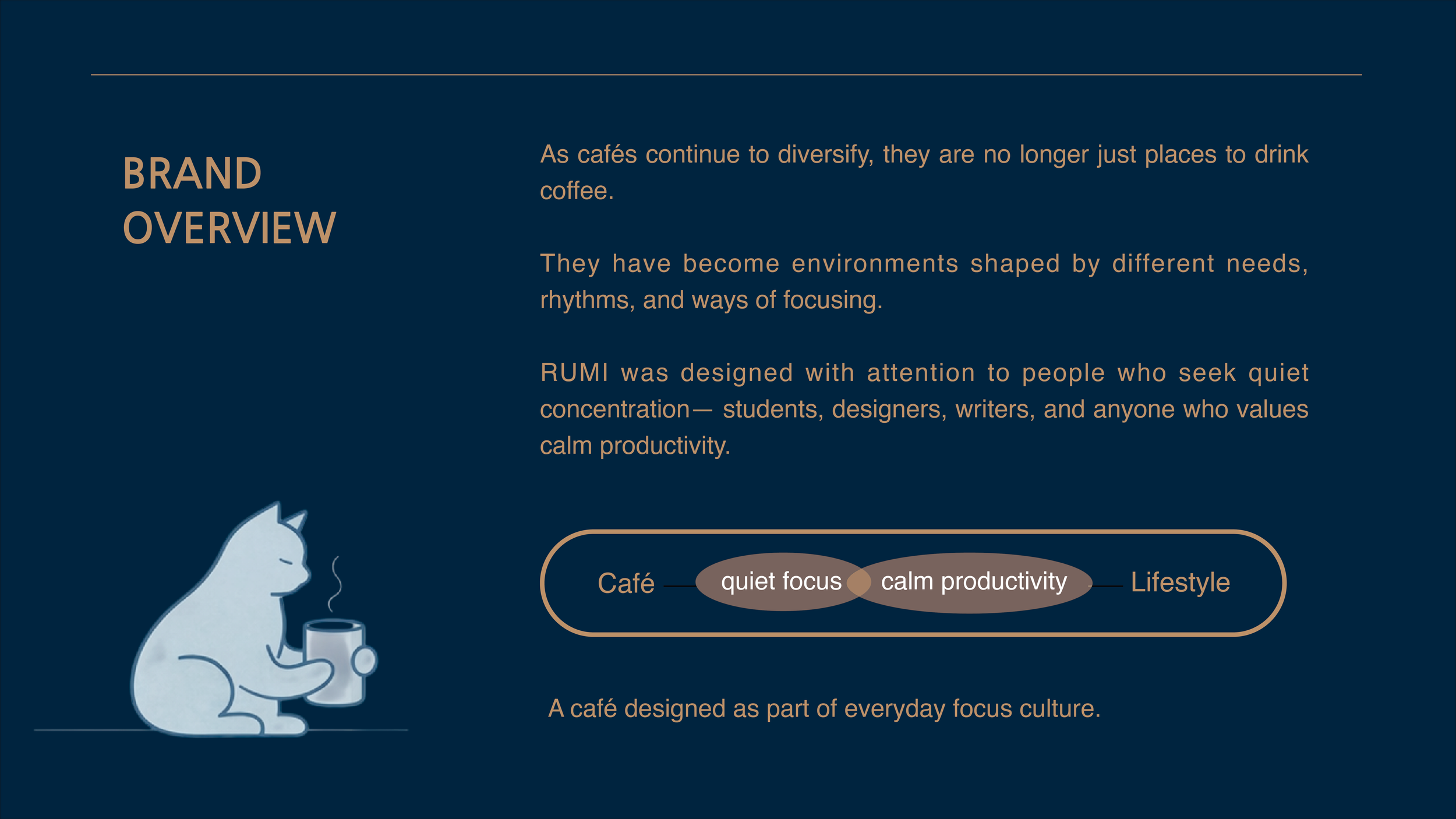
RUMI is a conceptual café brand designed to support calm focus in everyday moments.
The project explores how brand identity and visual systems can create a quiet, intentional experience across both physical and digital touchpoints.
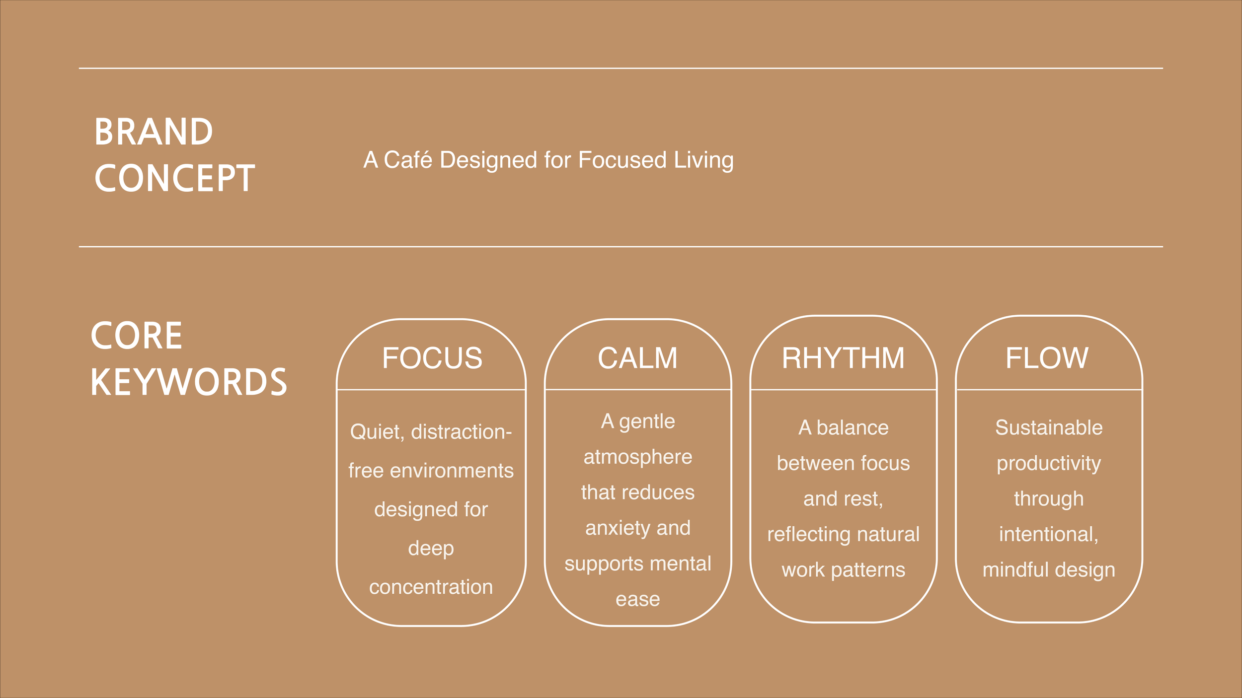
Through restrained typography, a soft color palette, and a cohesive visual system, the brand emphasizes clarity and focus without distraction.
Extending the Brand into Digital
A calm digital extension of the RUMI brand.
Designed to translate RUMI’s visual language into a focused, intuitive mobile experience.
Summary
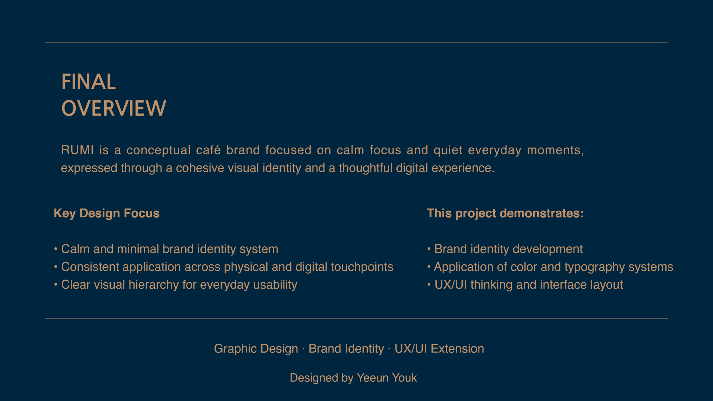
This project explores the creation of a café brand identity and its extension into both physical and digital experiences.
RUMI was designed as a calm, focused brand, and this project examines how visual identity, graphic systems, and interface design can work together to support quiet everyday moments.
Brand Focus
RUMI is a conceptual café brand designed for people who value calm focus and gentle productivity.
Through minimal graphic elements, soft color tones, and a symbolic character, the brand creates an environment that encourages concentration without pressure or distraction.
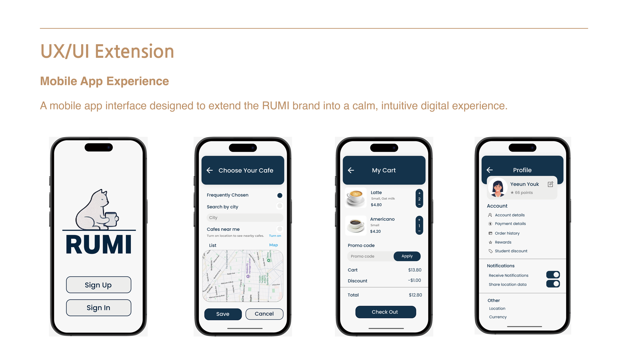
UX/UI Extension
Mobile App Experience
As an extension of the brand identity, a mobile app experience was designed to translate RUMI’s visual language into a digital space.
Rather than functioning as a standalone product, the app serves as a natural continuation of the brand—maintaining the same tone, rhythm, and sense of calm found in the physical brand touchpoints.
UI Exploration
Using the established brand guidelines, multiple interface directions were explored to ensure visual consistency across digital screens.
The exploration focused on applying typography, color, spacing, and illustration in a way that preserves clarity while reinforcing the brand’s soft and intentional character.
The Design Challenge
In digital environments, users can easily feel overwhelmed by unclear structure and excessive visual elements.
The challenge was to design an interface that supports focus and ease, while remaining visually aligned with the brand identity rather than feeling overly technical or product-driven.
Design Approach
Applied the brand’s visual system to interface layouts and components
Simplified screen structure to reduce visual and cognitive overload
Used illustration and white space to introduce warmth and emotional clarity
Built a consistent design system to support scalability and coherence across screens
The Result
The final mobile interface functions as a calm digital extension of the RUMI brand.
By combining graphic design principles with UX/UI thinking, the project demonstrates how brand identity can guide user experience while maintaining visual clarity, consistency, and focus.