Understanding Korean Taste — Editorial Design
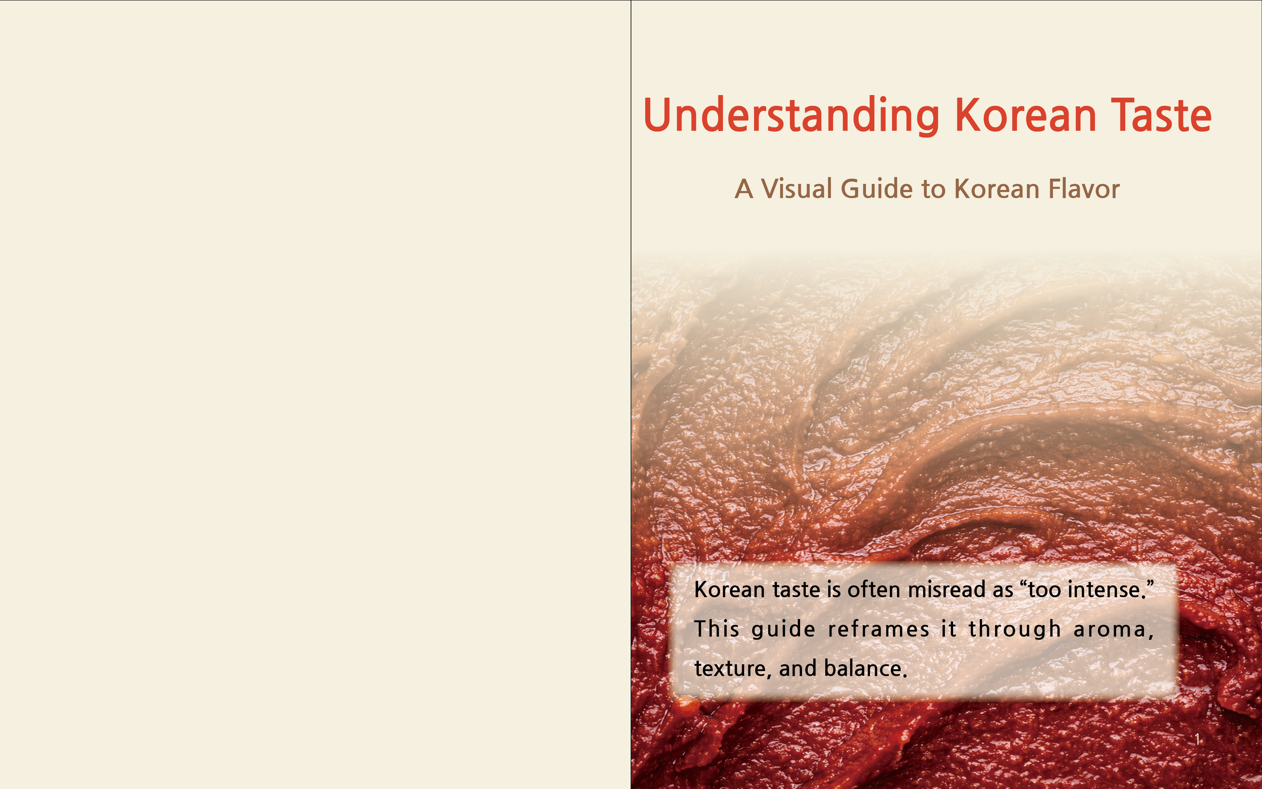
Understanding Korean Taste is an editorial design project that explores how Korean food is often perceived before it is tasted.
Rather than focusing on recipes or instruction, the project examines assumptions around flavor, aroma, and intensity, and reframes them through visual structure, comparison, and narrative layout.
Through typography, imagery, and sequencing, the book translates cultural perception into a clear and approachable visual experience.
Summary
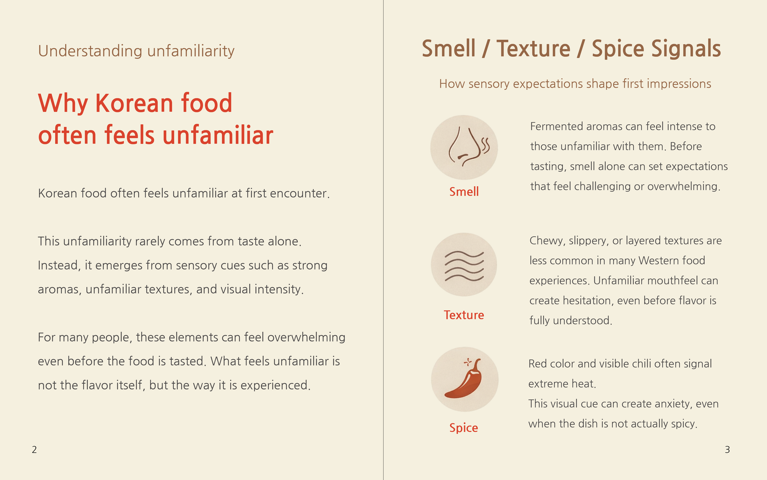
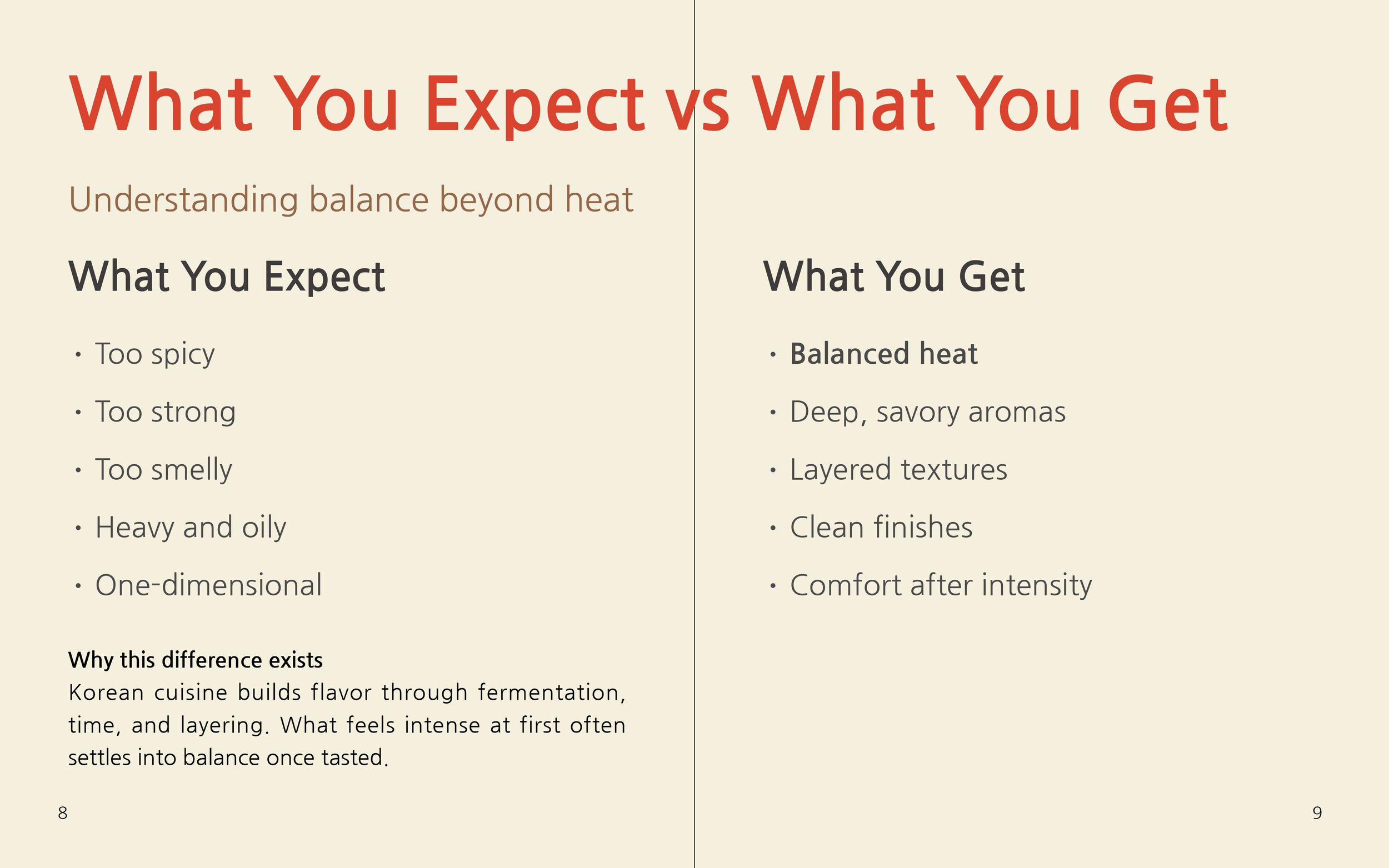
This project explores how Korean food is often misunderstood through simplified assumptions—such as being too spicy, too strong, or too unfamiliar—and how design can help reframe those perceptions.
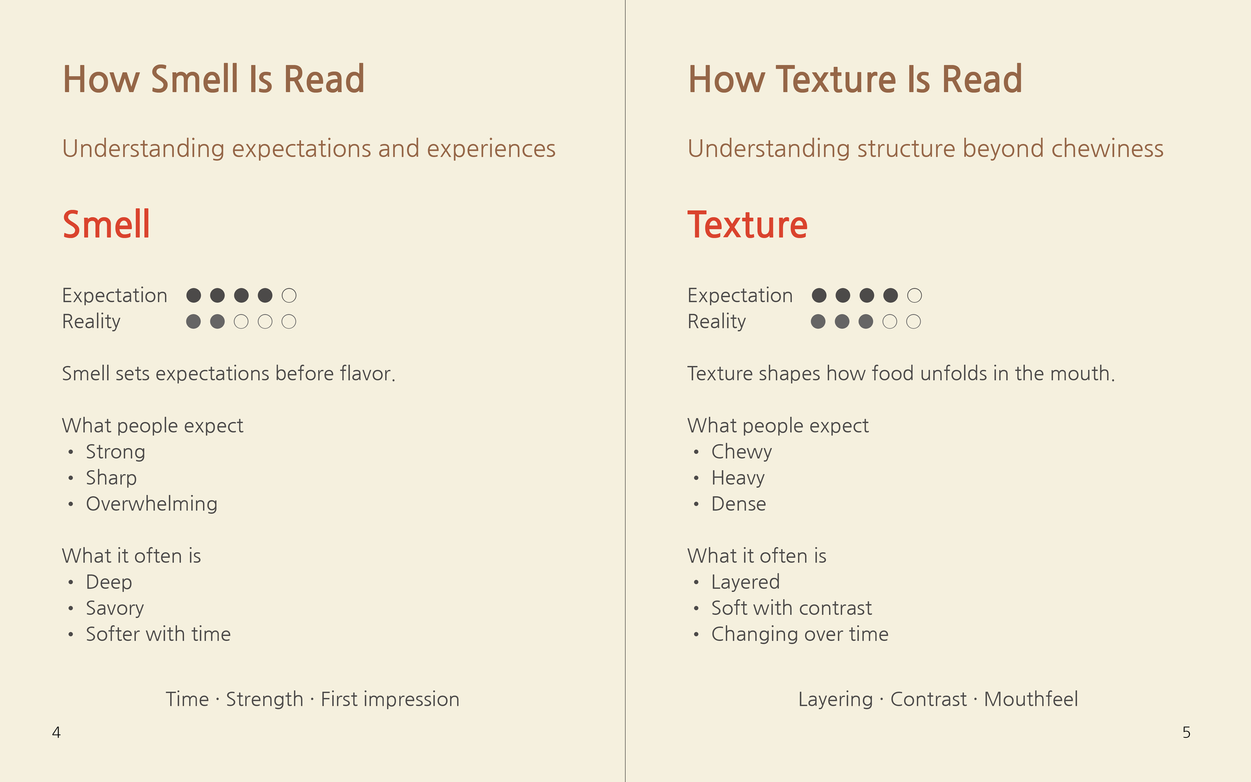
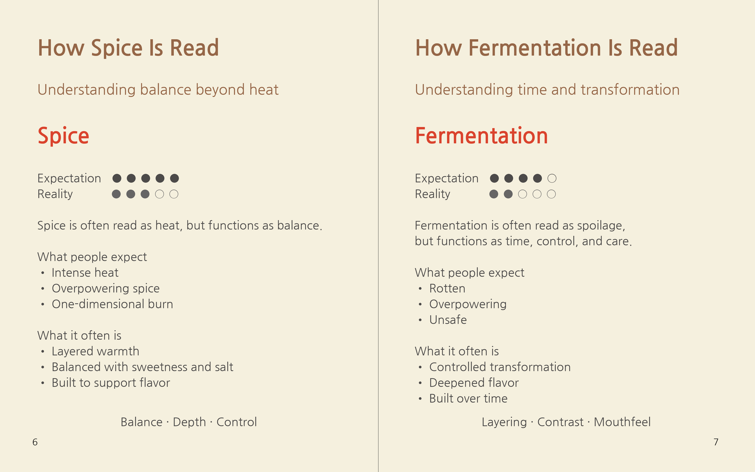
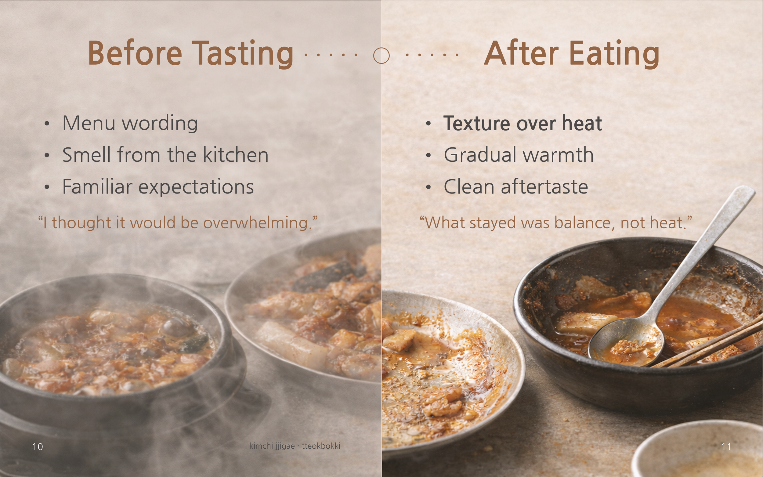
Rather than teaching recipes or flavors, the book focuses on perception: how smell, texture, time, and balance shape taste before and beyond eating.
Through visual comparisons, restrained typography, and a consistent graphic system, the project invites readers to reconsider what they think they know about Korean food.
Project Focus
The focus of this project is not instruction, but reinterpretation.
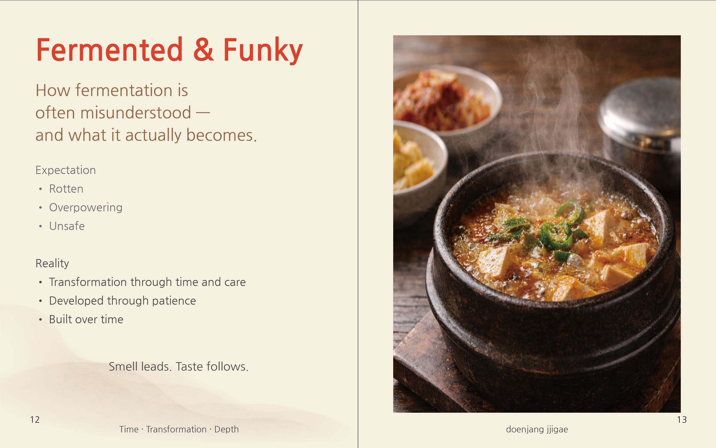
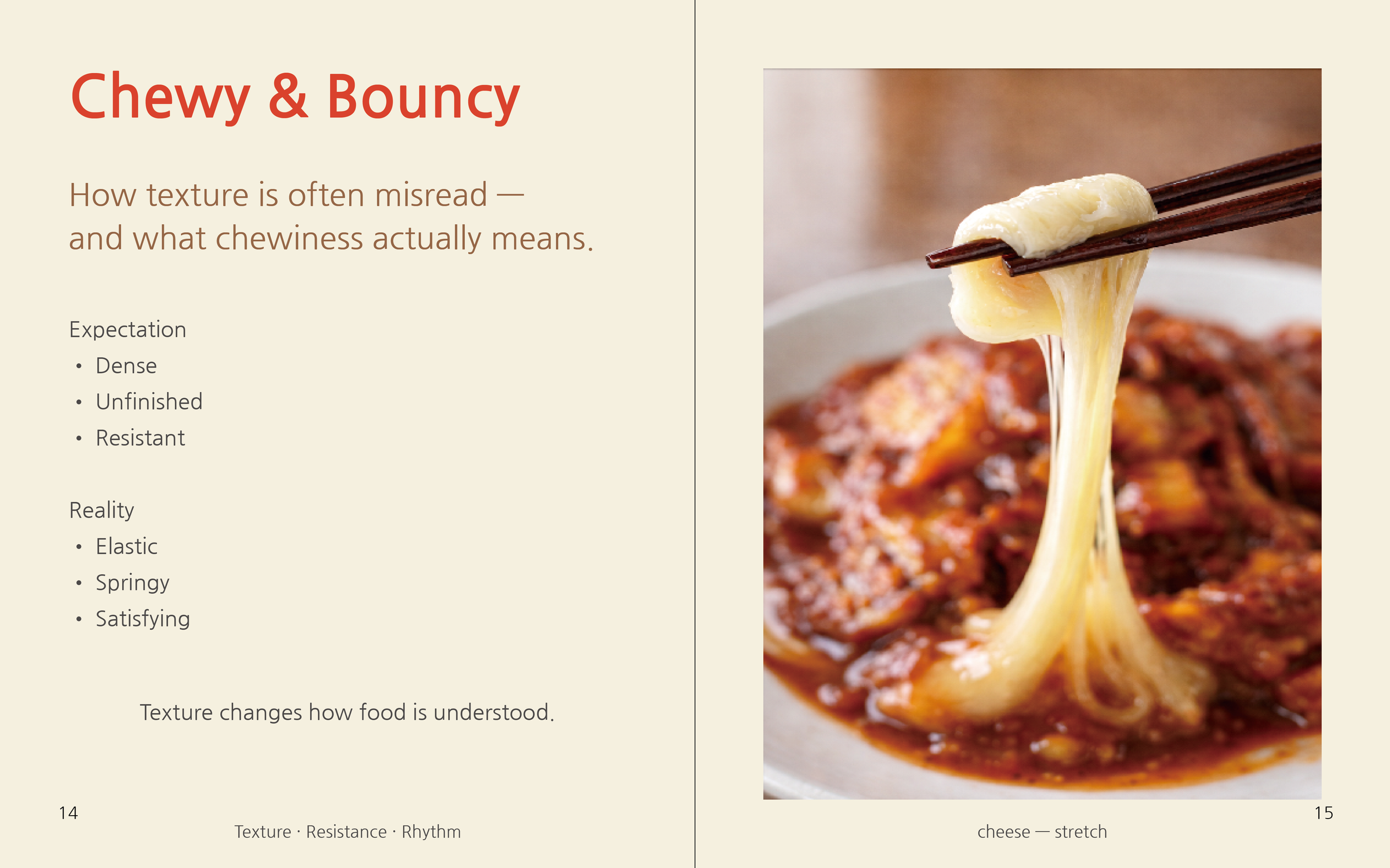
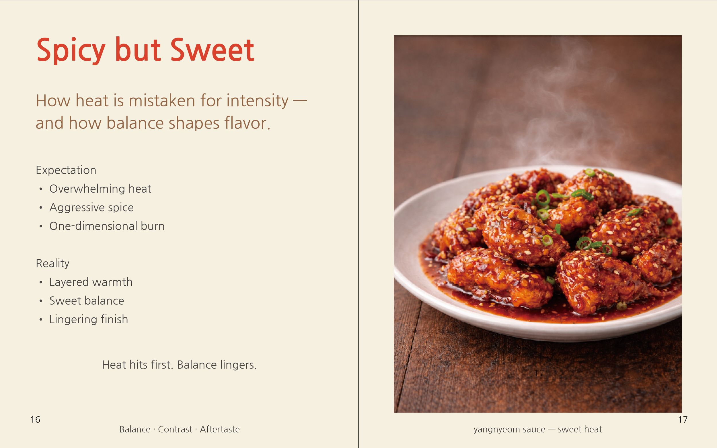
Each section addresses a common misconception—fermentation as rot, chewiness as undercooking, heat as pain—and reframes it as a layered sensory experience.
The design emphasizes clarity and restraint, allowing space for reflection rather than explanation.
Visual rhythm, spacing, and hierarchy are used to guide perception instead of overwhelming it.
Design Approach
The project is structured around a clear system to support perceptual understanding:
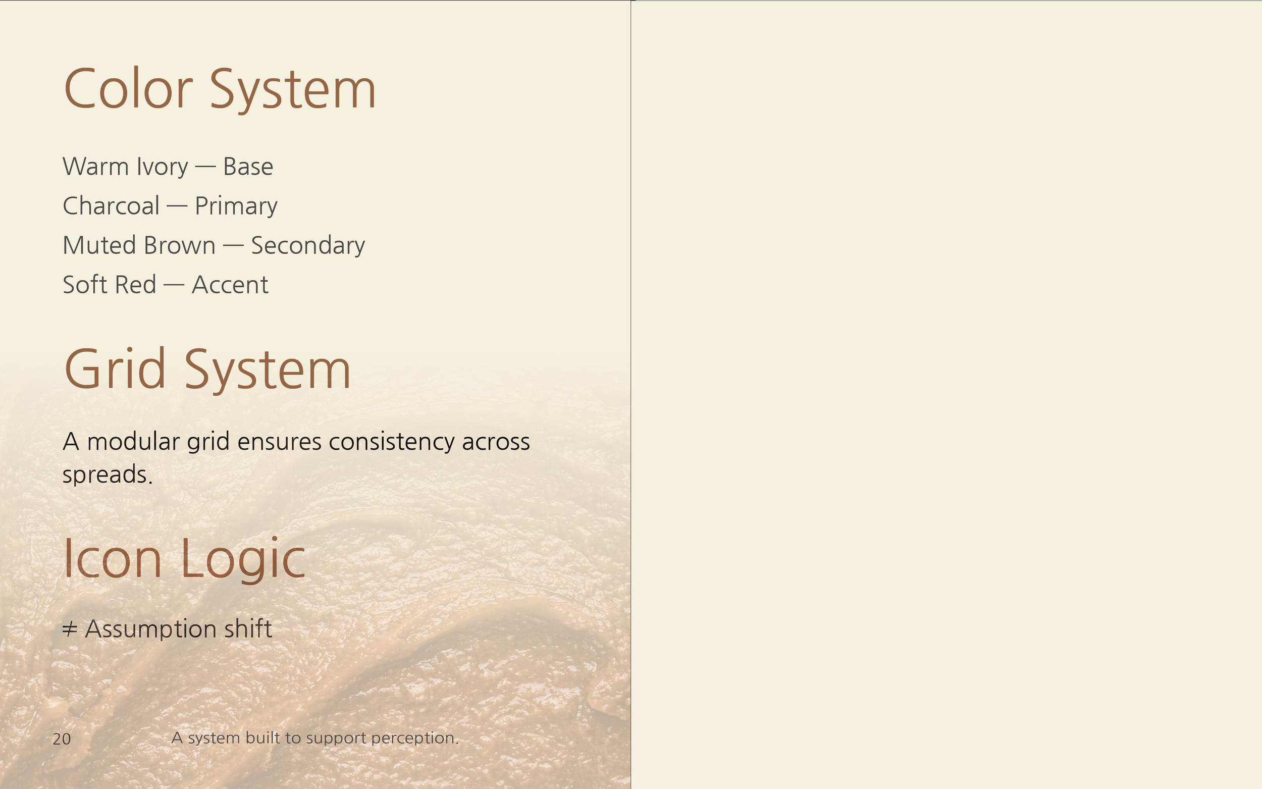
A limited, warm color palette to reduce visual noise
A modular grid system to maintain consistency across spreads
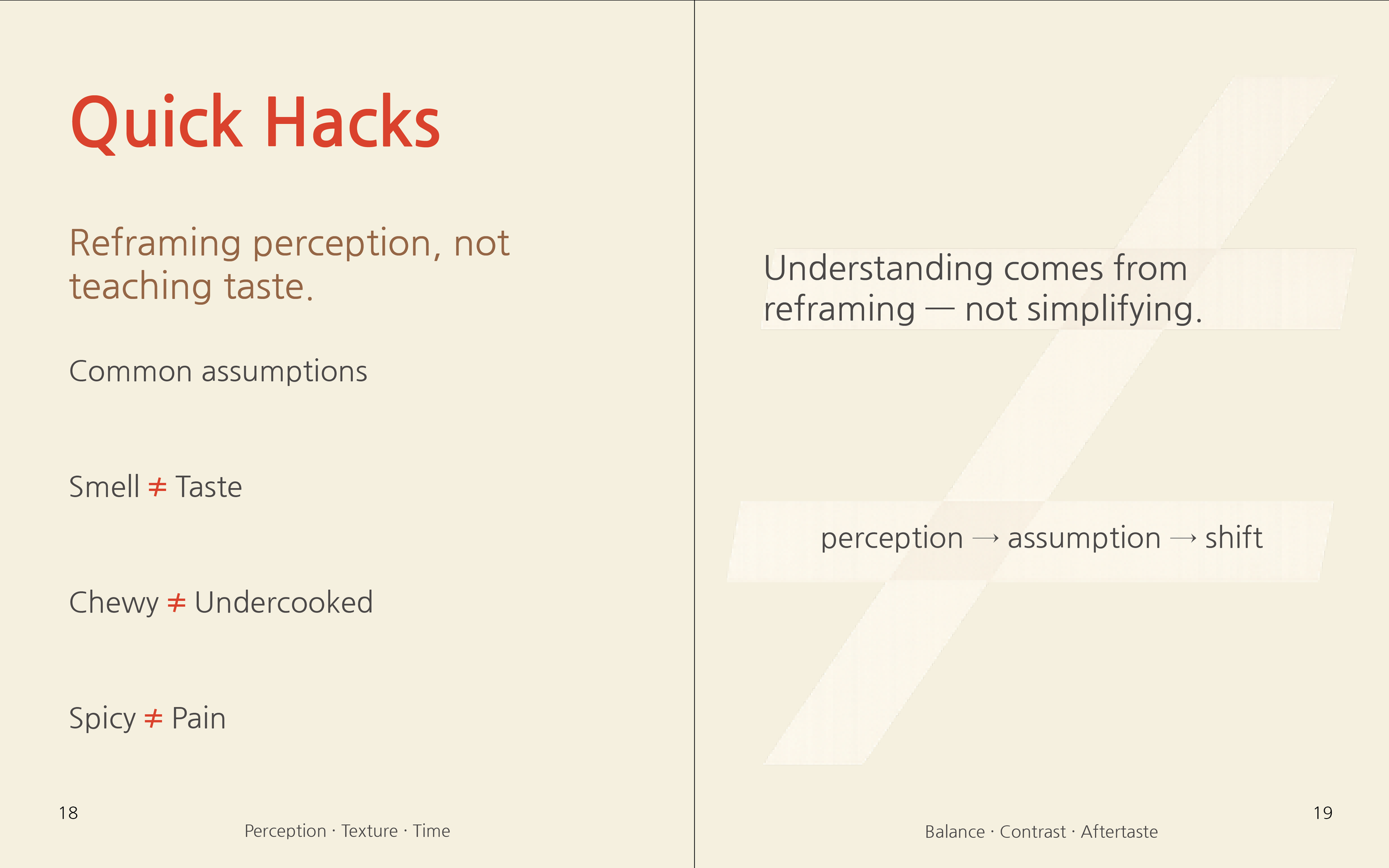
Simple typographic hierarchies that separate assumption from reality
The repeated use of contrast (≠) as a visual cue for assumption shifts
Rather than relying on decorative elements, the design system reinforces the book’s core idea: understanding comes from reframing, not simplifying.
Outcome
The final book functions as a visual guide to perception rather than a traditional food book.
It demonstrates how graphic systems and editorial design can shape the way cultural experiences are interpreted, encouraging readers to slow down, observe, and rethink familiar assumptions.
